Attractive and stylish interiors often draw inspiration from natural elements and accents, which allows you to experiment with how you decorate your home by mixing up different hues and textures together. It is also an excellent way to incorporate your favorite flowers without overwhelming the space with too many pink, yellow, or green shades.
As seasons change, so too do interior color trends. This year has brought an explosion of vibrant and cheerful hues like baby pinks, lemon yellows, and tangerines into home design trends – colors that once may have seemed saccharine. Still, when combined with browns and off-whites, they look sophisticated and elegant.
Decorative Ideas Inspired by Interior Color Trends
To keep your home fresh with stylish interiors, you will need to stay updated on the latest interior trends. In 2023, expect to see a resurgence of warm, earthy colors like terracotta, as well as the use of natural materials. You can incorporate these trends into your color combinations and overall decor.
Get ready for some decorative ideas inspired by the latest interior trends, and learn how the art of interior color design can truly make your space shine.
1. Serene Neutrals with a Pop of Teal
Teal is an eye-catching accent color, ideal for creating dramatic designs or infusing a room with soothing energy. It complements many neutral tones beautifully, making it suitable for many interior design styles.
Teal can make any space feel elegant and sophisticated when used in tandem with light neutrals, creating an air of elegance and sophistication. Teal also looks gorgeous when combined with warm natural tones like terracotta, putty, and khaki; its earthy tones recall images of rocky landscapes, prehistoric discoveries, and sandy deserts, as well as furniture such as wooden flooring or accent pieces that feature this hue.
Create a tranquil haven in your home by combining soft, neutral tones like beige or gray with a vibrant pop of teal. This combination adds a touch of serenity and a splash of energy to your space. Consider teal throw pillows, artwork, or an accent wall against a neutral backdrop.
Teal makes for an attractive pairing with other warm hues like orange and pink. When used sparingly, it can energize a space while stimulating your senses. However, too much teal could overwhelm a room, so be sure to leave ample breathing room through white or pale gray walls, accent pillows, and other accessories in order to achieve visually appealing designs.
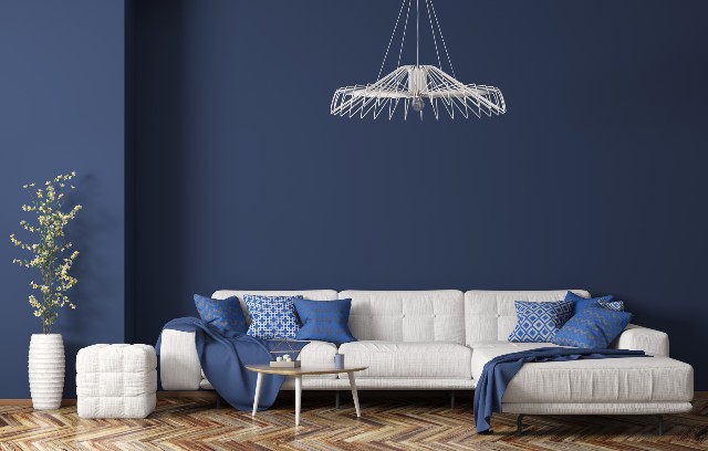
2. Timeless Navy and Gold
Navy and gold are always an elegant combination that complements different textures perfectly, making this pairing ideal for wedding designs or engagement parties. It also makes an excellent color combination in a baby nursery, or any design project meant to convey youthful energy.
This color combination adds a new twist to the classic complimentary duo of red and green, which often creates unintended contrast when fully saturated. Instead, this combination works to balance their tones so they do not compete against one another – perfect for communicating eco-friendly values or natural ingredients in designs.
Navy blue paired with gold is a classic color combination that exudes sophistication. It’s perfect for creating an elegant and welcoming atmosphere. Try navy blue walls with gold-framed mirrors or gold accent pieces against a navy sofa.
3. Earthy Greens and Rich Browns
Earth tones provide a warm, welcoming backdrop for any design scheme, with colors such as terracotta, earthy greens, and neutral sandy beiges making an impression of comforting warmth while remaining modern and relevant.
Brown pairs effortlessly with various hues to form unique, on-trend color palettes. India Blue makes for an eye-catching combination when combined with browns that feature warm undertones for a vibrant combination.
Neutral shades make an excellent pairing with earth tones, creating a soft yet layered aesthetic that echoes nature’s beauty. Try pairing earthy tones with creamy neutrals such as Slipper Satin or Old White from Farrow & Ball for a luxurious and elegant result.
Embrace nature indoors with earthy greens and rich brown tones. This color combination brings the outdoors in, creating a warm and inviting environment. Incorporate houseplants, green cushions, and brown wooden furniture for a harmonious look.
4. Playful Pastels with Charcoal Gray
Even though charcoal gray is considered neutral, that doesn’t preclude its use as an eye-catching accent color in patterns or as an eye-catching backdrop for brightly-hued rugs, wood floors, or furnishings that stand out. This earthy palette evokes the natural beauty of rocks and water with a mix of earthy tones, such as yellow and terracotta hues that recall sky or lake waters; muted blue hues come from skies or lakes, while muted yellows add warmth.
Charcoal grey can bring depth and refinement to any space, be it an office or bathroom. Use it to create a clean and polished aesthetic in either space while pairing it with white walls and light accents makes incorporating this sophisticated neutral into any room easy.
For a touch of whimsy, consider combining soft pastels like blush pink, mint green, or baby blue with a grounding charcoal gray. This pairing adds a sense of balance to your interior design. Try pastel-colored curtains with charcoal gray furniture or walls.
5. Bold Black and White
Sometimes, the simplest color combination can make the most powerful statement. Black and white create a timeless, high-contrast look that’s both modern and classic. Think black and white stripes, checkerboard floors, or a monochromatic gallery wall.
If you’re feeling adventurous, experiment with bold black-and-white color schemes for your interior design project. Black and white schemes add drama and timeless beauty while being popular choices among modern and contemporary home styles alike.
Conclusion: Elevate Your Home with Color
No matter your goals for decorating, color can make all the difference in creating an aesthetic and luxurious living space. Follow these tips, and you will discover how easy it is to transform any room in your home with color!
When selecting colors for your home, avoiding themes is of utmost importance. An over-designed room that lacks character may quickly turn into an eye sore if its theme becomes overdone; to avoid this trap altogether, look for subtle design elements that aesthetically incorporate your theme.
First, decide the overall mood and desired colors you wish to achieve in your space. Next, seek inspiration in nature, magazines, or online – pay special attention to undertones, as this can change how the hue appears in your room. If you need help getting started, try creating a mood board or scrapbook of colors that inspire you. Look for patterns among these pictures as a source of guidance when selecting hues to incorporate into your own home.
Keep in mind that interior color trends change over time. While certain hues might have been fashionable one year (for instance, mauve and sea foam were very trendy in the ’80s), they could quickly become outdated next year. Therefore, select paints and fabrics with timeless appeal, such as earthy greens or soothing blues, for optimal results. Your home is your masterpiece; paint it with the colors that resonate with your soul.